Data Analysis And Statistics With R Assignment Sample
Comprehensive Statistical Analysis of Ecosystem Data Using R: Unveiling Ecological Trends Through Univariate Analysis, Hypothesis Testing & Regression Models
- 92650+ Project Delivered
- 1500+ Experts 24x7 Online Help
- No AI Generated Content
Introduction Of Data Analysis And Statistics With R Assignment
Here in this project the developer has asked to do the statistical analysis of the given dataset using the R software. Here the developer has to estimate the values from the given dataset. This dataset has been based on the statistical values of the ecosystem. Here in this context the developer is said to predict and analyze the histogram graph, the box plot graph and the density probability graph for the given dataset. Again the open analysis, hypothetical analysis and the linear regression values has been assessed using the R Software. By assessing the values of the predictive values the preferred statistical distributive analysis has been evaluated in the below context.
Looking for top-notch academic assistance? Turn to New Assignment Help for expert guidance and support. Our online assignment help in the UK ensures that students receive impeccable solutions tailored to their needs. Plus, explore our vast repository of Free Assignment Samples for inspiration and reference.
Discussion
- UNIVARIATE ANALYSIS:
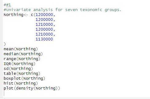
Figure 1: The Univariate Analysis for Northing.
(Source: Self created in R studio)
The above code snippet shows the Univariate analysis of the Northing. Here the developer has applied the data values of the Northing. Here in this project the developer has tried to calculate the mean value of the Northing (Cressie, N., et al 2019). With that part the developer also has tried to calculate the median value, range of the Northing , the inter quartile range of the variable, standard deviation of the variable, and the frequency table. By the frequency it can be determined how frequently an event occurs in the observation frequency. Here also the box plot, histogram , and the density plot has been evaluated.
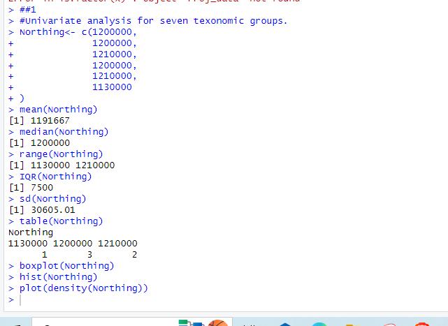
Figure 2: The outcome of the Univariate analysis.
(Source: Self created in R software)
The above outcome has been calculated on behalf of the value of Northing . Here the developer has depicted those values to calculate the mean value of the variable as well as the median value, range value, and the interquartile range value, standard deviation of the event, the frequency table has been assessed (Shalabh, S., 2022). The mean value of the Northing is 1191667. The median value is 1200000. The range of the value is 1130000 to 1210000. The interquartile range of the 7500. Here the standard deviation is 30605.01. Here the table is also created to show the frequency of the values thus how frequently the values have occurred in this series.
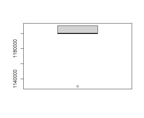
Figure 3: The Box plot diagram for Northing.
(Source: Self created in R studio)
The Box plot diagram of the Northing has been evaluated in the above figure. By the Box plot graph the analysis of the datasets has been assessed for the Northing (Vidal-Piñeiro, D., et al 2020). From this graph the bare minimum value, top quartile value, average value, third quartile value, and the highest possible value has been assessed.
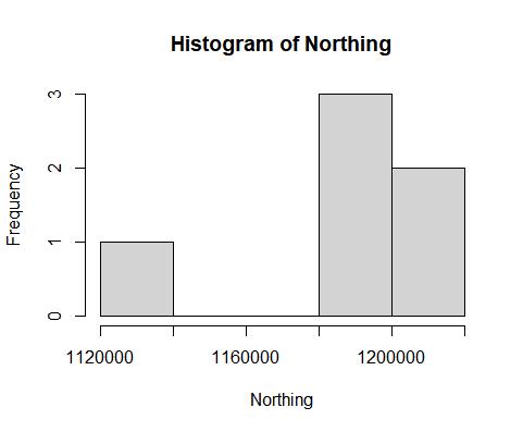
Figure 4: The histogram for Northing.
(Source: Self created in R studio)
It is the Histogram plot for the Northing. Here in this plot the developer has shown the graphical representation of the frequencies using the vertical bars (Touchon, J.C., 2021). It is one of the techniques to plot the distributive values in the dataset in the graphical manner.
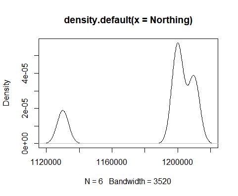
Figure 5: The density plot diagram for Northing.
(Source: Self created in R studio)
Each of the graphs are providing the various different perspectives for the distributive analysis of the stipulated values of the variables.
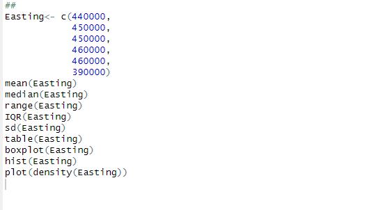
Figure 6: The Univariate Analysis for Easting.
(Source: Self created in R studio)
The above code snippet is given to show the Univariate analysis of the Easting. Here the mean value, median value , range value, inter quartile range value and the standard deviation has been assessed using these codes.
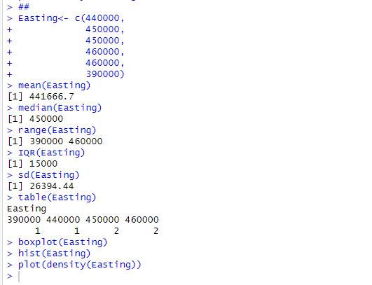
Figure 7: The Outcome of Univariate Analysis for Easting.
(Source: Self created in R studio)
The resultant value of the mean, median and the range has been evaluated from the above figure. Here the frequency table is also assessed to show how frequently the Easting values occurred in this stipulated range of the values. The mean value is 441666.7 (Mondéjar Ruiz, D., et al 2020). The median value is 450000. The range of the Easting value for the stipulated values has been assessed for 390000 to 460000. The inter quartile range value of the Easting is 15000. The standard deviation value is 26394.44. And the frequency table has been shown to implement how frequently the easting values have been found in these events.
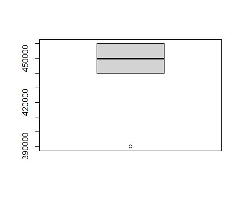
Figure 8: The Box plot diagram for Easting.
(Source: Self created in R studio)
The box plot diagram of the Easting has been assessed for the numerical distribution of the variables . Here the Box plot distribution is shown for the representation of the minimum, maximum, median and the first and third quartile distribution for the Easting.
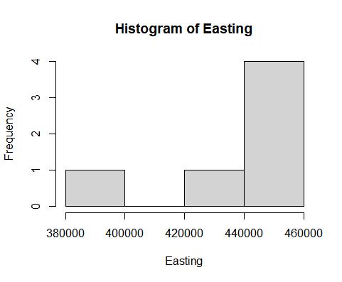
Figure 9: The Histogram plot for the Easting.
(Source: Self created in R studio)
The histogram plotting for the Easting has been shown for the representation of the frequencies for the variables of the Easting. Here the values are taken from the different contiguous values of the Easting variables. The height of the bar represents the number of the values present in the range of the Easting values.
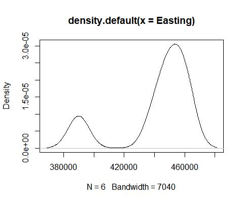
Figure 10: The Density plot for the Easting.
(Source: Self created in R studio)
The Density plot graph has been plotted for the representation of the numerical distribution of the different variables. Here the kernel density is estimated for the probable values in the estimated range value.
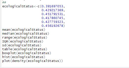
Figure 11: The Univariate analysis for ecological status.
(Source: Self created in R studio)
The above code snippet is given to show the Univariate analysis of the status of the ecological values. Here the mean value, median value , range value, inter quartile range value and the standard deviation has been assessed using these codes.
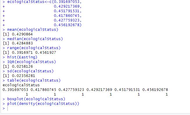
Figure 12: The Outcome of Univariate Analysis for ecological status.
(Source: Self created in R studio)
The statistical analysis has been done to evaluate the univariate analysis for the ecological status. Where mean is 0.4290864, median is 0.4284883 and the standard deviation is 0.02356281.
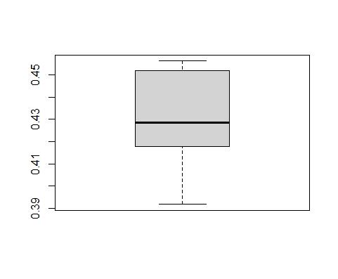
Figure 13: The Box plot diagram for ecological status.
(Source: Self created in R studio)
The box plot diagram of the ecological status has been assessed for the numerical distribution of the variables . Here the Box plot distribution is shown for the representation of the minimum, maximum, median and the first and third quartile distribution for the ecological status.
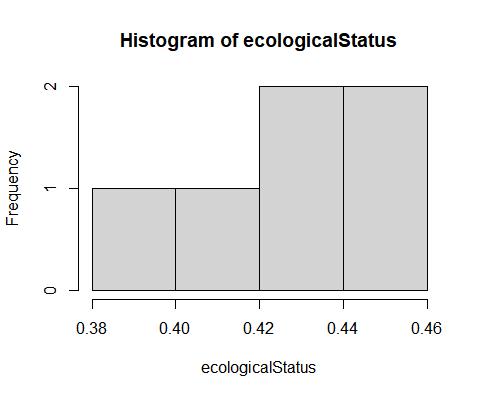
Figure 14: The Histogram for Ecological stats.
(Source: Self created in R studio)
The above outcome has been assessed for the histogram of the ecological status. The height of the histogram shows the frequencies of the variables of the ecological status.
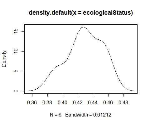
Figure 15: The density plot of the ecological status.
(Source: Self created in R studio)
The density plot for the ecological status. It is the numerical distribution of the ecological status.
Figure 16: The Univariate analysis for Vascular plants.
(Source: Self created in R studio)
The above code snippet is given to show the Univariate analysis of the vascular plants. Here the mean value, median value , range value, inter quartile range value and the standard deviation has been assessed using these codes.
Figure 17: The Outcome of Univariate Analysis for vascular plants.
(Source: Self created in R studio)
The mean , median and standard deviation of the vascular plant has been assessed here. The mean (0.5941888) , median (0.5862372), and standard deviation (0.03600164) are respectively evaluated to show the univariate analysis of the vascular plant.
Figure 18: The box plot diagram for the vascular plant.
(Source: Self created in R studio)
Here the Box plot diagram of the vascular plant has been assessed to show the numerical distribution of the vascular plant.
Figure 19: The Histogram of the vascular plant.
(Source: Self created in R studio)
The histogram plot of the vascular plant has been assessed.The height of the histogram shows the frequencies of the variables of the vascular plant.
Figure 20: The density plot of the vascular plant.
(Source: Self created in R studio)
The density plot for the vascular plants. It is the numerical distribution of the vascular plants.
Figure 21: The Univariate analysis for Grasshoppers.
(Source: Self created in R studio)
The above code snippet is given to show the Univariate analysis of the Grasshoppers. Here the mean value, median value , range value, inter quartile range value and the standard deviation has been assessed using these codes.
Figure 22: The Outcome of Univariate Analysis for Grasshoppers and crickets.
(Source: Self created in R studio)
It is the outcome values for the statistical distribution of the grasshoppers and the crickets. Here the mean is 0.2222222, median is 0.25 and the standard deviation is 0.04303315.
Figurte 23: The box plot for the grasshoppers and crickets.
(Source: Self created in R studio)
It is the box plot for the grasshoppers and the crickets. Here the numerical distribution of the different statistical values can be assessed.
Figure 24: The histogram for the Grasshoppers and crickets.
(Source: Self created in R studio)
The histogram has been created by assessing the event values of the grasshoppers and crickets. Here the height of the histogram shows the frequency of the event.
Figure 25: The density plot for the grasshoppers and crickets.
(Source: Self created in R studio)
The density plot for the grasshopper and the crickets shows the numerical distribution of the grasshoppers and the cricketers.
Figure 26: The Univariate analysis for Macromoths.
(Source: Self created in R studio)
The above code snippet is given to show the Univariate analysis of the Macromoths. Here the mean value, median value , range value, inter quartile range value and the standard deviation has been assessed using these codes.
Figure 27: The Outcome of Univariate Analysis for Macromoths.
(Source: Self created in R studio)
It is the outcome values for the statistical distribution of the macromoths. Here the mean is 0.3361229, median is 0.351378 and the standard deviation is 0.07281553.
Figure 28: The box plot for the Macro Moths.
(Source: Self created in R studio)
It is the outcome of the box plot for the statistical distribution of the macro moths that has been assessed.
Figure 29: The Univariate Analysis for Butterflies.
(Source: Self created in R studio)
The above code snippet is given to show the Univariate analysis of the Butterflies. Here the mean value, median value , range value, inter quartile range value and the standard deviation has been assessed using these codes.
Figure 30: The Outcome of Univariate Analysis for Butterflies.
(Source: Self created in R studio)
The statistical values show the descriptive analysis of the taken range and the univariate analysis is done for butterflies. Here the mean is 0.5353238, the median value is 0.4987671 and the standard deviation is 0.07759138.
Figure 31: The Box plot diagram for the Butterflies.
(Source: Self created in R studio)
The box plot diagram for the butterflies has been assessed for the numerical distributions.
Figure 32: The Histogram plot for the Butterflies.
(Source: Self created in R studio)
The histogram plot for the butterflies to analyze the frequencies for the different values with the height of the plots.
Figure 33: The density plot for the Butterflies.
(Source: Self created in R studio)
The density plot has been assessed here by the numerical distributions of the butterflies.
- HYPOTHESIS TEST:
Figure 34: The Hypothesis Test for Butterflies and Easting.
(Source: Self created in R studio)
The above code snippet shows the Hypothetical analysis for the two variables. Here the developer has taken any two variables from the given dataset, such as the butterflies and the Easting.
Figure 35: The Test result of the T-test.
(Source: Self created in R studio)
It is the test result for the hypothetical analysis of the Butterflies and the Easting. Here the developer has two types of hypothetical test that is one is the t test and the other one is correlation test. The value of the t- test is 0.32181.
Figure 36: The Correlation test.
(Source: Self created in R studio)
The correlation test has been done here for the hypothetical test of the butterflies and the easting. The correlation test result shows that the true correlation value is not equal to 0. And the confidence interval has been gained up to 95 percent. The cor value is -0.02321437.
3.SIMPLE LINEAR REGRESSION:
Figure 37: The output value of the Simple linear regression of the BD7 and BD11.
(Source: Self created in R studio)
The outcome of the simple linear regression has been evaluated here by applying the two variables BD7 and the BD11. Here the BD7 represents the mean value of the 7 taxonomic groups. And the BD 11 shows the mean value of the 11 taxonomic groups. By assessing this values the p value is evaluated.
Figure 38: The simple linear regression graph for the BD7 vs BD11.
(Source: Self created in R studio)
Here the simple linear regression graph has been plotted by applying the means of the seven and eleven taxonomic groups respectively. Here the BD11 is taken in the x-axis and the BD7 has been taken in the y-axis. It shows that the most of the error points have occurred in the higher values of the BD11.
- Multiple linear regression:
Figure 39: The outcome of the multiple linear regression
(Source: Self created in R studio)
It is the output of the multiple linear regression . Here the developer has tried to show the extensive propagation of the simple linear regression. This method is mainly used for the prediction of the output of the given variables. There also the assessment of the multiple predictors can be analyzed by the use of the multiple distinct predictors with their predictable values in the comparison with the x-axis and the y-axis. Here the p values or the beta coefficients are assessed for the implementation of the weightage of the given variables. Here as per the requirement the developer has taken the BD4 and has analyzed the different multiple linear regression plots for each taxonomic group. In this way the relationship between them had been evaluated.
Figure 40: The multiple linear regression plot has been plotted.
(Source: Self created in R studio)
Here it is the multiple linear regression graph for the assessment of each taxonomic group and the BD4 . Here the estimated value for the regulation of the dependent variables and the independent variables has been assessed here.
Figure 41: The outcome for the decision tree.
(Source: Self created in R studio)
Here the outcome has been assessed for the open analysis of the data attributes.
Figure 42: the outcome of the decision tree.
(Source: Self created in R studio)
Here the decision tree has been builded for the particular data attributes. [Refer to Appendix 1]
Conclusion:
Here from the above discussion it can be said that the analysis of the various data in accordance with the ecostat data has been assessed. Here in this context the data has been assessed using the univariate analysis, linear regression model, and by the hypothetical model evaluation. Thus the data model has been applied and assessed for solving the different attributes using the r software.
Reference list
Journals
Wikle, C.K., Zammit-Mangion, A. and Cressie, N., 2019. Spatio-temporal statistics with R. CRC Press.
Shalabh, S., 2022. Univariate, bivariate and multivariate statistics using R: Quantitative tools for data analysis and data science. Journal of the Royal Statistical Society Series A: Statistics in Society, 185(2), pp.736-737.
Mowinckel, A.M. and Vidal-Piñeiro, D., 2020. Visualization of brain statistics with R packages ggseg and ggseg3d. Advances in Methods and Practices in Psychological Science, 3(4), pp.466-483.
Touchon, J.C., 2021. Applied statistics with R: a practical guide for the life sciences. Oxford University Press.
Zamora Saiz, A., Quesada González, C., Hurtado Gil, L., Mondéjar Ruiz, D., Zamora Saiz, A., Quesada González, C., Hurtado Gil, L. and Mondéjar Ruiz, D., 2020. Data Analysis with R. An Introduction to Data Analysis in R: Hands-on Coding, Data Mining, Visualization and Statistics from Scratch, pp.183-271.
Kabacoff, R., 2022. R in Action: Data Analysis and Graphics with R and Tidyverse. Simon and Schuster.
Hui, E.G.M., 2019. Learn R for Applied Statistics. Eric Goh Ming Hui.
Ramachandran, K.M. and Tsokos, C.P., 2020. Mathematical statistics with applications in R. Academic Press.
Al-Karkhi, A.F. and Alqaraghuli, W.A., 2019. Applied statistics for environmental science with R. Elsevier.
Harrer, M., Cuijpers, P., Furukawa, T.A. and Ebert, D.D., 2021. Doing meta-analysis with R: A hands-on guide. CRC press.
Winter, B., 2019. Statistics for linguists: An introduction using R. Routledge.
Kvam, P., Vidakovic, B. and Kim, S.J., 2022. Nonparametric Statistics with Applications to Science and Engineering with R (Vol. 1). John Wiley & Sons.
Maronna, R.A., Martin, R.D., Yohai, V.J. and Salibián-Barrera, M., 2019. Robust statistics: theory and methods (with R). John Wiley & Sons.
Balduzzi, S., Rücker, G. and Schwarzer, G., 2019. How to perform a meta-analysis with R: a practical tutorial. BMJ Ment Health, 22(4), pp.153-160.
Balduzzi, S., Rücker, G. and Schwarzer, G., 2019. How to perform a meta-analysis with R: a practical tutorial. BMJ Ment Health, 22(4), pp.153-160.