
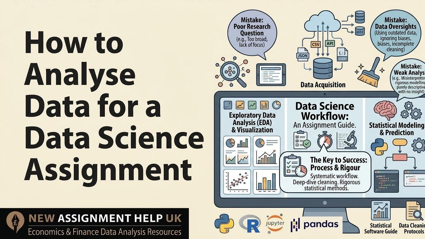
How to Analyse Data for a Data Science Assignment
A student models house prices, reports 94% accuracy and still loses marks. Because the test data had leaked into training. Data analysis for a data science assignment means turning a raw dataset into a defended answer to one question. Here this how to analyse data for a data science assignment guide covers what UK university markers look for, from framing the question to checking for leakage. Each step includes the specific checks that move work from a 2:1 towards a first.
What UK Markers Actually Grade
Most data science rubrics weigh five major areas. That includes problem framing, data preparation, method choice, interpretation and reproducibility. Working code earns only a share of the marks. Markers also read your reasoning, so a correct model with no stated justification scores low.
The gap between grade bands is usually evidence. A 2:1 applies sensible methods and describes the results. A first test its assumptions, compares alternatives, and states what the findings cannot prove. Check the weightings in your module handbook and spend time where the marks sit. Once you know where the marks are, the first job is a sharper question.
Frame One: Question Before You Open the Data
A vague brief produces vague analysis, so fix the question first. "Analyse the London Airbnb data" becomes "Which listing features best predict nightly price in zones 1 and 2?" Then settle four details:
- Target variable: The outcome you predict or explain, such as price.
- Unit of analysis: What one row represents, such as a single listing.
- Scope: The period, area or group you include.
- Success metric: The measure of a good answer, such as an RMSE under £25.
If you choose your own dataset, use credible sources such as the ONS, the UK Data Service or NHS Digital, and note the licence. With the question fixed, the dataset needs inspecting.
Clean the Data and Defend Each Choice
Markers care less about whether you cleaned the data than about whether you can justify how.
- Missing values → Run df.isna(). mean() to see the share missing per column. Under 5 per cent, dropping rows is usually safe. Above 30 per cent, consider dropping the column or imputing by group median.
- Outliers → Flag values beyond 1.5 times the interquartile range, then check each one. A £9,000 nightly price may be a genuine penthouse.
- Duplicates and types → Remove exact duplicates, convert dates to datetime, and merge labels such as "London" and "London".
Log every change in a short table showing what changed, how many rows it affected, and why. It proves to the marker that your process is repeatable. There, clean data lets you explore with confidence.
Explore the Data With a Purpose
Each chart should lead to a decision, so write the consequence beside it. Start by plotting the target's distribution. A right-skewed price variable often needs a log transformation before regression. Next, build a correlation matrix and calculate variance inflation factors. A VIF above 5 means two predictors overlap enough to distort coefficients. Box plots compare groups, and scatterplots reveal curves a straight line will miss.
Under every chart, state what you saw and what you did about it. "Price is skewed (skewness 3.2), so I applied a log transform" earns credit. These findings now decide which method actually fits.
Select Methods and Test Them Properly
Pick from the below-given techniques that suit the question, then prove they work.
- Predicting a number: linear regression first, then random forest regression as a comparison.
- Predicting a category: logistic regression, with a decision tree as the challenger.
- Finding groups: k-means, using the elbow method and silhouette score to justify the cluster count.
- Comparing groups: t-test or ANOVA after a Shapiro-Wilk normality check, or Mann-Whitney if it fails.
Split the data before any scaling or imputation, otherwise information leaks from the test set. Use five-fold cross-validation. Report RMSE or MAE for numbers, and F1 or AUC when class sizes are uneven. Compare against a baseline, such as predicting the mean, because a model that barely beats it is a finding worth reporting. Remember, numbers only earn marks once they are explained.
Interpret Results Like a Researcher
Translate each result into the language of your question. "Each extra bedroom adds about £38 per night, holding other variables constant" works well. Pair p-values with effect sizes and confidence intervals, since a significant result can still be too small to matter. Check residual plots for patterns that point to a missed relationship.
Then state limits plainly: sampling bias, missing variables, and the gap between correlation and cause. If your data holds personal information, note how UK GDPR and the Data Protection Act 2018 shaped your handling. A final review catches what late-night editing misses.
Pre-Submission Checks
Run through these once before you upload.
- Does the conclusion answer the exact question in your introduction?
- Does your notebook run top to bottom after restarting the kernel?
- Is a random seed set so results repeat?
- Does every chart have a title, labelled axes and a comment?
- Are the limits and one realistic next step stated?
Check your last feedback for comments where the marker asked "why" or "justify". Those point to the weakest links in your reasoning, so fix them first. And now if you want a second opinion before the deadline, then you can go for data science assignment support, who can review your method and interpretation.
.jpg)
 9 | MSc Computer Science (Dist.), AI & Data
Hi I am Edward Campbell. I am a professional academic writer and have been in the occupation for more than 7 years. I have completed my MSc in Computer Science (Dist.), AI & Data from the University of Oxford with a gold medal. I like programming and found of teaching others. If you are stuck with your CS assignment, dissertation, or any other paper then you can connect with me. I will help you ace your academic work.